Some mailbox inspiration
Full disclosure - the below example comes from a former coaching client of mine. Broadmead Care. I am a donor and received this example from them. I instantly appreciated this pack and it’s always delightful to see fundraisers spreading their creative wings. Kudo’s to Shannon Donnelly and her team for producing this pack.
As I looked it over - I thought I could share the 20 things that I love about it and the 11 things I would suggest to make it a bit better - and not to take anything away from it - but there is always room for improvement isn’t there?
Outer Envelope


<3:
Love the use of handwriting in the the top left corner of this outer envelope. It feels personal, like Janet took the time to send me a letter and I would love to know why!
It is closed face. With a handwritten name and address on it. It doesn’t have a window, which adds to the feeling of it feeling like personal mail.
The tagline on the back is provocative. What’s the mission? What can I do? How can I do it? Also is was added in Janet’s handwriting. All written and scanned and placed into the design. Simple and effective.
Feedback:
Would have suggested using an envelope that wasn’t a #10 (or standard sized). 80%(ish) of all the mail your donor gets (maybe 30-40/week in Canada, 30-40 a day in the USA) arrives in this size! So it’s quite hard to stand out when you are also using the same size.
Would have considered using a first class stamp for a portion of the mailing. Your mid to high levels, monthlies, legacy and loyal donors… better yet - multiple stamps!
Letter


<3:
There are many things I love about this letter. Most importantly, it actually asks for something. Our gardens, responsible for providing many magical moments to our residents need some TLC and your gift of $X will do just that.
Is very specific on how much we need to raise. $57,143.
The letter feels very personal. From the desk of Janet Power.
Plenty of white space, “typed” in big font (ooooo courier - be still my heart).
The P.S. (often the only thing a donor looks at) reiterates why Broadmead and Janet are reaching out.
This letter is very skimmable. If all I did is read the parts that have emphasis (as many donors do), I would understand why I am being mailed and asked, and making me feel seen and appreciated.
Lot’s of “I” and “you” throughout.
Feedback:
I like to lead with a “you” question. Dear Mandy, Do you enjoy spending time outside in your garden like I do? Engages donors from the get go.
The letter has a reading ease of 73.4% and written at a grade level of 6.1. Both are quite acceptable. You are ideally looking for a reading ease of 80% or greater and a grade level of 4-6. One easy way to do that is to read your letter out to someone. You will instantly find ways to make sound more conversational. (PRO TIP - some of the best copywriters out there will speak out loud and record their letters - and then have it transcribed. Easy hack.)
Would have included a photo of Janet. Simple way to establish a human connection to the other human ‘talking’ to me.
For mid to high level donors, you could have gone to a 4 page letter with more narrative and more specifics on what needs to get done and what it might cost. This content can also go into an insert or back of a reply form - especially the specifics - rational information.
Reply
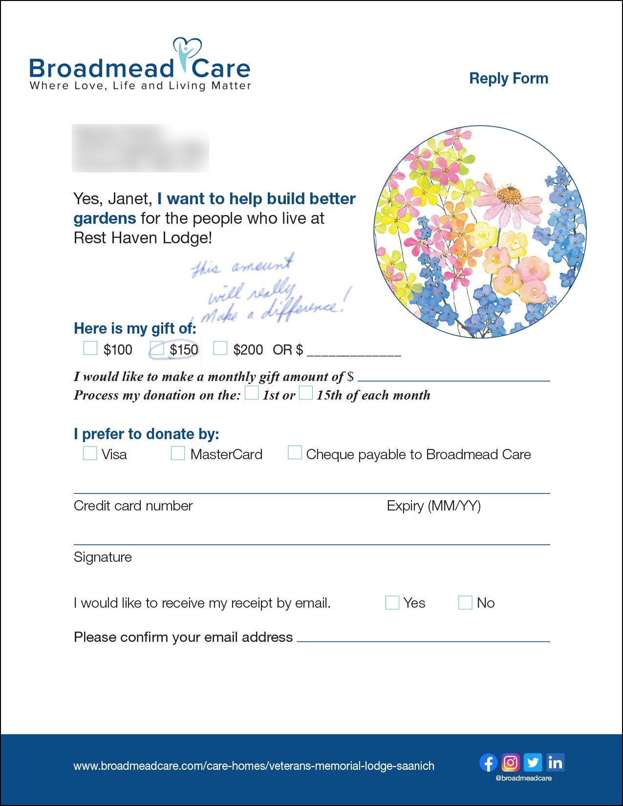

<3:
The reply form is for your donor. I like using her name nice and big at the top.
It is full sized - 8.5” x 11”. Yes - that matters.
The YES line repeats what you are asking me for and why. For those donors who put aside reply forms until December (yes, that’s quite common) they will instantly remember why they set it aside in the first place.
It circles the middle amount. Decision science tells us that donors will gravitate towards giving that amount. (It’s called the Goldilocks effect.)
The use of handwriting again here makes it doubly effective.
I like that there is a ton of white space (thank you full size reply form) and big open spaces for donors to write their information in.
Plants a nice big legacy seed on the back. If you are running a legacy program (you have a legacy program right? RIGHT?), then inviting people to reach out to learn more is great.
Feedback:
When you know exactly how much you need to raise, I put that amount in the gift array. It can often help raise your average gift.
Ideally only asks for a single cash gift. Yes, you want monthly donors. And yes, in testing, sometimes asking for both won’t harm your results. However - analysis paralysis is a thing. The more you ask me for or to consider, the more I may just walk away.
Include a photo number with a direct line to a human to take donations over the phone whenever possible.
With any legacy information, always try to include a photo and name of the person responsible for legacy donors and a direct line and email for contact.
Lift

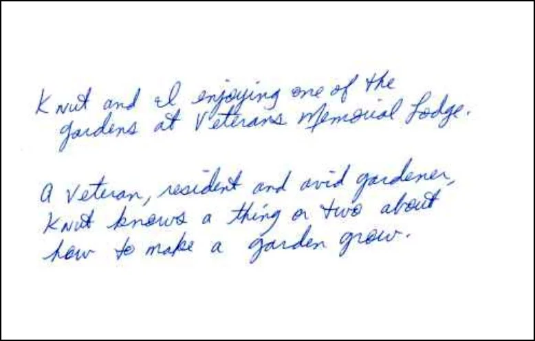
<3:
They call them lifts because that’s what they can do - lift response. A simple piece like this is perfect. I love the use of a photograph - and I can see Janet helping a resident water the plants!
Simple photo. Big smiling faces. Yes! Giving can provide more of that!
The handwritten note on the back is the chef’s kiss!
Feedback:
None really. For mid to high level donors - I would have seen if we can get this printed on photo paper - and sticky noted the message (even better personalized) - and paper clipped it to the letter.
BRE
Not shown. But please, trust me, get a BRE (not just a reply envelope) for your donors to easily return their gifts in!
KEY TAKEAWAYS
If I was grading this pack - it would be a decent 8.5/10. Or higher.
One of the most astounding things Shannon shared with me was that 2/3rds of all gifts that they received, were upgraded gifts. These upgrades were a large part of helping her meet and surpass her goal! Holy Hannah - these tiny things make a big, big difference.
This pack feels very personal, very approachable and very understandable.
Do you see these kinds of packs at conferences? Sadly no - people are too busy talking about AI - but these types of packs are the real workhorses of successful fundraising programs.
If you want help developing packs like this or need some help auditing what you are doing with ideas on how to make it better, email me at john@agentsofgood.org anytime.