26 direct mail ideas you can steal from one pack
The summer (in North America anyhow) tends to be a quiet time for sending out mail appeals.
They can be a little hit or miss.
Late this spring, we were working on a June mailing for STEGH Foundation (who I wrote about this past January and their YE appeal).
And like the mailings before it, we applaud Amanda Campbell and the whole team at STEGH for going the extra mile for their appeals and their donors.
I worked with Rachel Zant on this appeal and we wanted to share the 26 ideas that you can steal right now to make your next appeal more successful.
I’ll go first!
Outer Envelope
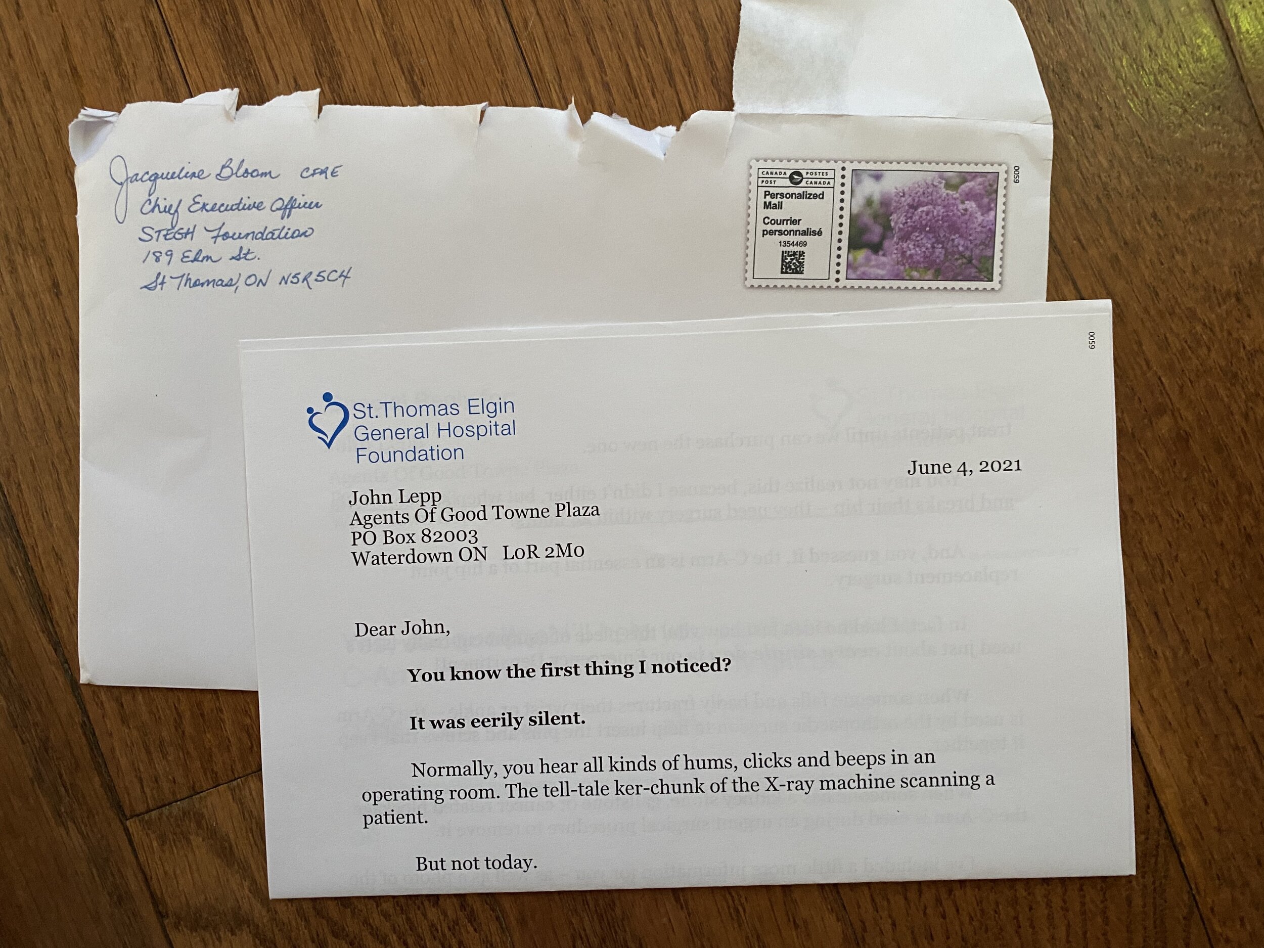
1. Was a 9”x6” envelope. Testing tells us that almost anything other than a white #10 will do better in the mail.
2. It was closed face. It didn’t have a window. Makes it look more like personal mail than using a window.
3. We asked the letter signer, Jacqueline Bloom, to hand write her name and return address for us and we scanned that in and put it on the outer. No logo, no focus on this PMS colour or this specific font. This makes the outer look more personal from Jacqueline to the donor. Which is the point. Obviously.
4. We used a personalized mail indicia. Testing has shown us that a commemorative stamp > first class generic stamp > visual indicia > standard indicia > meter postage…
5. We used an image of lilacs in the indicia. Anyone in southern Ontario would know what that is and instantly be able to smell them since they are everywhere and gorgeous at this time of year.
All of these things add up to a highly engaging and ‘openable’ envelope.
Next is the letter.
6. It was designed to look like a personal letter from Jacqueline to me, the donor. Personalized, indented, lots of white space, hardly any ‘design’ and used a large serif font.
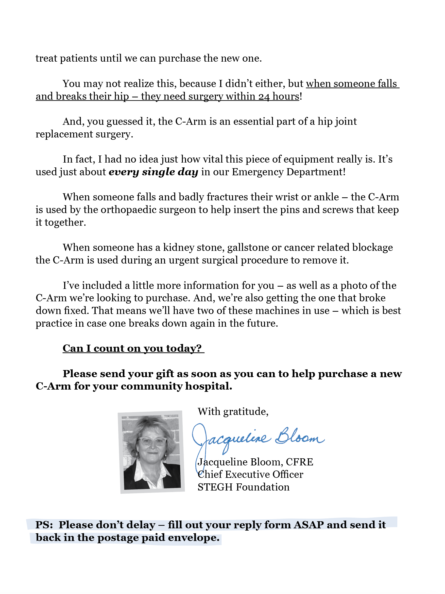
7. Emphasis. Look at what is bolded and underlined. Some donors will only read or look at these things and make a decision to give or not. Make sure everything that you highlight will keep them engaged or move them to give.
8. We cut off the last paragraph on page one. I know a lot of people who HATE this. Think it’s a mistake. It isn’t. It’s done so the donor will flip the letter over to keep reading.
9. We also used a helpful “Please turn over…” written by Jacqueline as well.
10. We included a photo of Jacqueline by her signature so donors could envision who was talking to them in the appeal. Humans give to humans and we are constantly trying to remind donors that they are talking to other humans.
11. Jacqueline’s signature is very clear. You can see she took the time to write it out cleanly so it is readable. This very small thing does send visual clues to your donor – that you CEO or ED isn’t so important that they don’t have the time to ensure that their name is written cleanly.
The reply form.
12. It is full size. 8.5” x 11”.
13. It is personalized for me. The donor.
14. The gift array was also personalized to my previous giving.
15. We included an option for giving $198,000 – which is what we needed to raise. Doing this might seem a bit cheeky (and it is) but there have been instances where donors have checked that box or at the very least give a little more than what they tend to since they actually know what you are going to do with their gift.
16. It has a ton of white space.
17. If a donor wanted to give online or by phone, we made it easy to figure out how to do that or who to talk to!
Finally we added a lift note.
18. Lift notes of almost any type tend to do just that – lift response. Try adding something that rounds out the case or adds a little more detail to the appeal in some way.
19. We decided to add a photo of the thing we were raising funds for.
20. We had Jacqueline write out the message, which makes it feel far more personal than just type setting it.
21. We also included a business reply envelope, postage paid, for the donor to send their gift back in.
Rachel’s perspective and 5 bonus tips:
This letter started off as a bit of a struggle for me, I have to admit. I’d already written a great letter for this appeal - asking donors to fund a new ventilator. It was a slam-dunk, highly emotional, compelling letter about the most basic of all human needs: the need to breathe.
But then we found out the ventilator had already been funded. Back to square one.
We learned the hospital urgently needed to fund a new C-Arm. It didn’t sound all that exciting at first – not after a letter about a new ventilator during COVID. However, our amazing contact, Amanda, hooked me up to an interview with a wonderful hospital staff person who was able to tell me in great detail just how vital this piece of equipment actually was.
The ever-talented John Lepp suggested I imagine the sounds this machine might make (or not be making). And from there, it was pretty easy to start writing.
Here are my top five tips and takeaways:
1. Start with YOU! You’ll notice I started the first sentence off with a “you”. Sure, the lead would still have been compelling without it – but the “you” draws the reader in to become a part of the scene. The next few sentences set that scene up in vivid detail.
2. Short and sweet. I purposely started off with short sentences that are easy to read and scan. You want your donor to keep on reading until they get to the ask! You’ll also notice the lift note copy is very short too – just a handwritten note on the back of a photo.
3. Ask for one thing. The ask is very direct, urgent and for one thing only! It clearly explains the machine and the need, and that’s it.
4. Tangibility. I did the math and divided the cost of the machine by the number of donors receiving this appeal and it worked out to a nice ‘affordable’ amount for your average person, so that became our first ask amount. I’ve used this approach in other letters and it’s worked out well.
5. Be consistent.The “Yes-line” or CTA on the reply form reiterates the ask in the letter. It’s not the same generic line used in every single reply form sent out. All the pieces in this package are related to the same subject.
We decided to share this appeal since on the surface, it’s one of those not too sexy, a bit boring and standard appeals you all should be doing but don’t take the time to since you are in a rush to get to whatever is next in your schedule or focusing on the shiny other thing someone in the office is waving around.
This appeal only dropped a few weeks ago but is performing very well and strangely, is reactivating some long lapsed donors at a surprising rate. (Donors who haven’t given in 6 to 7 years are responding at 4.2%!!!!)
If you want to talk about this appeal more or how we can make your appeals stronger this fall, please reach out anytime to chat!


