A #donorlove newsletter makeover
Does your organization send newsletters to your donors?
A great #donorlove newsletter should do three things.
1. Report back on the impact of donor gifts.
2. Show a ton of gratitude for those gifts.
3. Ask for further support.
Doing these 3 things can raise a lot of money. Even more than a one off appeal. And I want to show you an example of a makeover we did last fall. Thank you to Humber River Hospital for allowing me to share this example with you.
This is cover. Let's take a look at it.
This strapline says: "This is a celebration of what you make possible."
Masthead: @ YOUR HUMBER. This piece is about MY hospital.
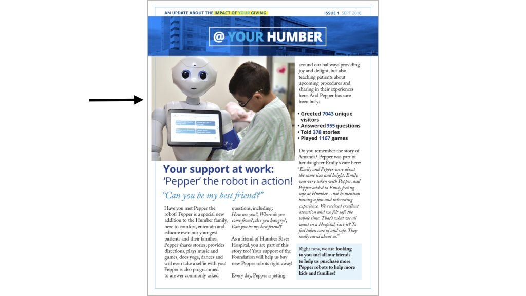
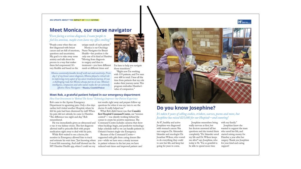
Great, warm photographs with lots of eye contact draw the donor in.
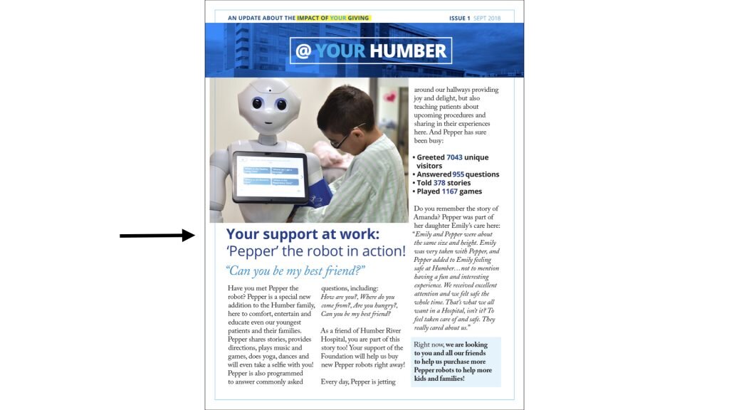
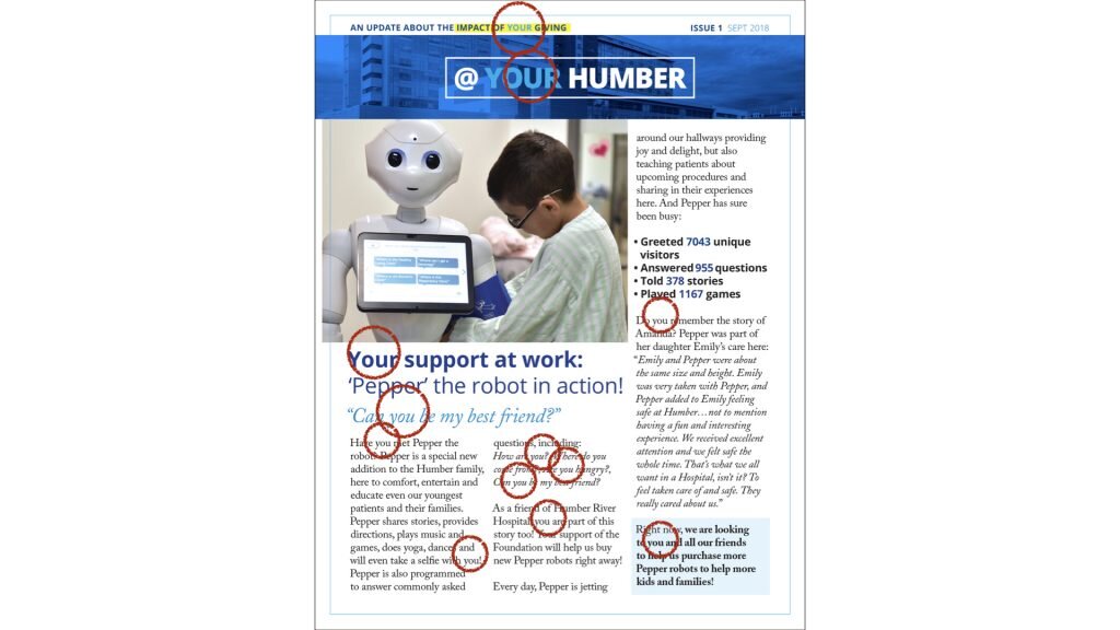
"YOU" featured headlines. This is about MY impact as a donor. As Tom Ahern says: YOU is GLUE. Use it!
Red pen test. Go through and circle all of the YOU's. Your articles and letters should look like they have the measles.
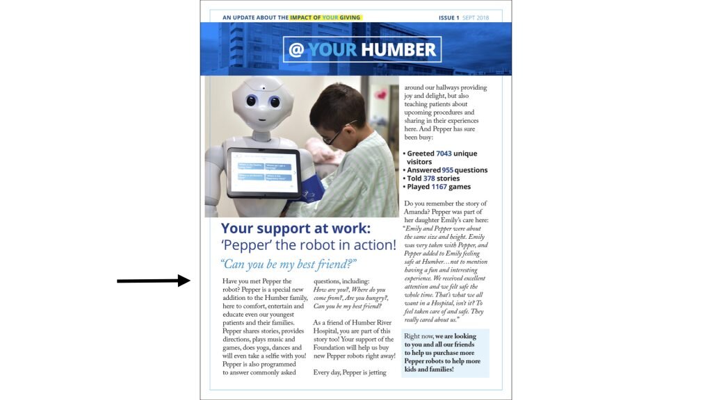
Body copy: Large, serif font - easy to read for donors.
Plenty of large, open skimable type. Plenty of white space.
Inside features lots of white space as well.
Nice, warm, engaging photographs. No reversed out type.
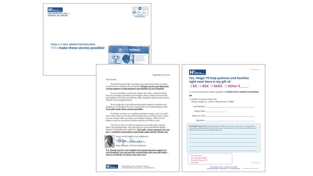
We sent it in a larger, 9" x 6" envelope and included a cover letter and a full size reply form asking for donor feedback on the revised newsletter.
So a quick recap, a brilliant donor newsletter should do three things.
1. Report back on the impact of donor gifts.
2. Show a ton of gratitude for those gifts.
3. Ask for further support.
If you want us to have a look at your newsletter - please reach out!


