Using nostalgia in direct response
The creative brief: Craft and send a direct mail pack to donors about our new capital campaign and inspire them to give to help us get closer to our goal.
Easy peasy, right?
Except… sometimes (ie: almost all of the time), your capital campaign case for support isn’t targeted or designed for your average annual donors. The question becomes, how can you make it relevant and compelling for those donors too?
The Regina Humane Society was months away from breaking ground on their new shelter for the animals of Regina. Very exciting.
We wanted to craft a pack that got donors attention as quickly as possible, stood out from the rest of the, ehm, pack — compared to the other mail they were getting in their mailboxes — and obviously, a pack that would move them to give and support the Society in this exciting project.
The RHS case was to raise funds to replace an aging structure with something more modern and suited for our animal friends needs and personalities.
A tool I occasionally reach for is: nostalgia.
Nostalgia can evoke the senses. The muscle memory of times that were once beautiful and moving but likely no longer exist. It can make us feel happy as we recall a simpler time with cherished moments.
When chatting to the client about the project, I had a flash of a memory.
Sitting in our small library that was converted out of a tiny bungalow in my hometown of Caistorville.
I could feel the hard plastic of the tiny seat where I sat. My feet moving along the soft, worn boards that were dipping in the middle of the floor from the weight of the shelves of books. I could smell the paper and marvel at the colours and covers that surrounded me.
My favourite section (I actually had two) was filled with old Charlie Brown anthologies, Calvin and Hobbes, Nuts, Clifford and many others.
But during that meeting, one popped into my brain. As soon as I say it, I expect you might have your memories and feelings flood into your brain.
Do you remember it? If you’re of a certain age, you probably do. If it doesn’t ring a bell, visually it likely will.
Busy Town was a book filled with all the different places and spaces where animals were shopping, driving, building, banking, resting, reading, eating etc.
I would spend hours looking at all of the various vignettes showing the hijinks of these fun and clever friends.
And I asked myself, what would Busy Town look like if these friends decided to come help our friends at the RHS build this new and amazing place.
As I so often do, I turned to one of our amazing AOG Creatives, Veronica Davies, for help to imagine what this would look like. I think Richard Scarry would be proud.
Kudo’s to a client like RHS that, often with deep breaths and a few “it will be ok” conversations, moves ahead with something that obviously is so very different from what they tend to do.
Working with Rachel Zant on the copy and Veronica on the illustrations, here’s what we came up with.
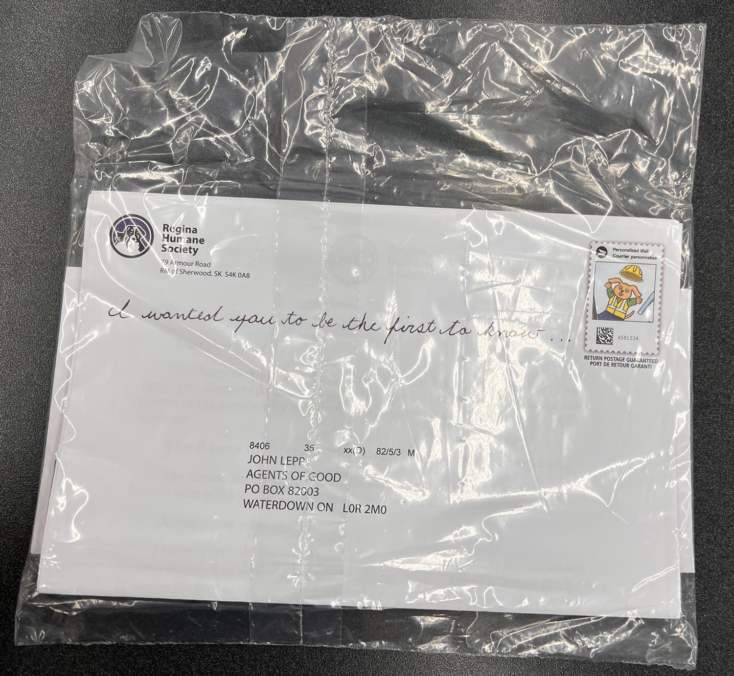
The pack was to go out in a 9” x 6” envelope - which we know from testing will often do better than a #10 envelope since so many packs your donor gets arrive in a #10 envelope. But just like everywhere else, supply chain issues have been a nightmare - especially as they relate to outer envelopes.
Karen Mercer, at RHS, was brilliantly able to source a see through wrap since she couldn’t get the envelopes we needed.
At first we were WTF - but I couldn’t really see a downside since this REALLY was going to be different than what donors were use to getting.
And that’s a GREAT thing when it comes to direct response and direct mail.
We used the logo and had Lisa Koch, the ED and letter signer, write out the line/tagline for the outer envelope. This added a very personal touch to an otherwise “professional” envelope. We also made a visually striking indicia for the OE. This is an envelope that, for MANY reasons, would get held, looked at and considered.
Even the tagline makes me (the donor) ask all sorts of questions that only helps get this pack ripped open.

10/10 every day.
As the donor starts to read the letter written by “Lisa” and Rachel Zant, we evoke the senses and emotions right from the get go:
Dear Jane,
Can you hear it?
The beep beep beep as the backhoe reverses into digging position. That deep, grinding scrape as it scoops up the first bucket of dirt. The whoops and cheers of the community members who have worked so hard to get us to this moment.
You’ll have to listen a little closer, but you might also hear…
The mews, barks, chirps and squeaks of the many deserving animal friends who will soon be moving into their brand new, “Almost Home”.
Do you know what else I hear?
I hear YOU. I hear your love and your compassion for animals coming through as a strong, steady heartbeat. You’ve been one of our cherished companions, cheering for animals from the very beginning.
You can read the rest of the letter and look at the reply here if you want but I want to move to the insert since that’s why I’m writing this blog post after all…

We wanted to visually engage the donors with something they might have seen before but even if they hadn’t - we made it fun and visually interesting as our animal friends had obviously begun work on something very important!
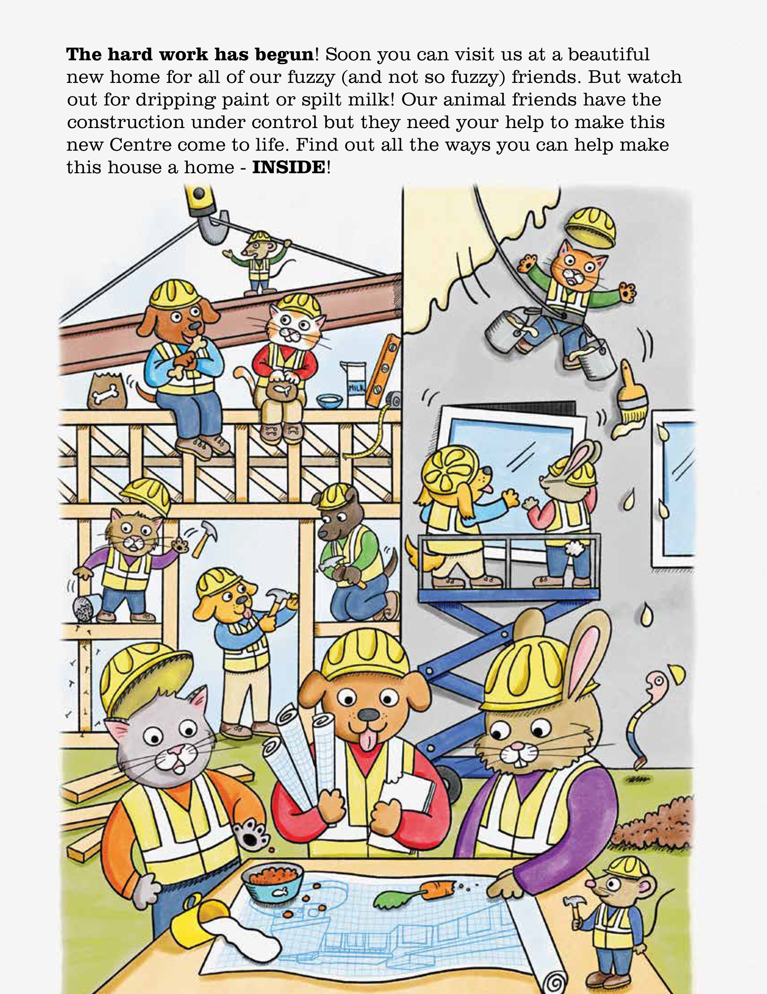
What draws you in, as a reader or viewer, is the little whimsical details of the scene. Even if you don’t read a word of it, you are smiling as you look and take in the scene of our friends as they work hard on building this brand new place.
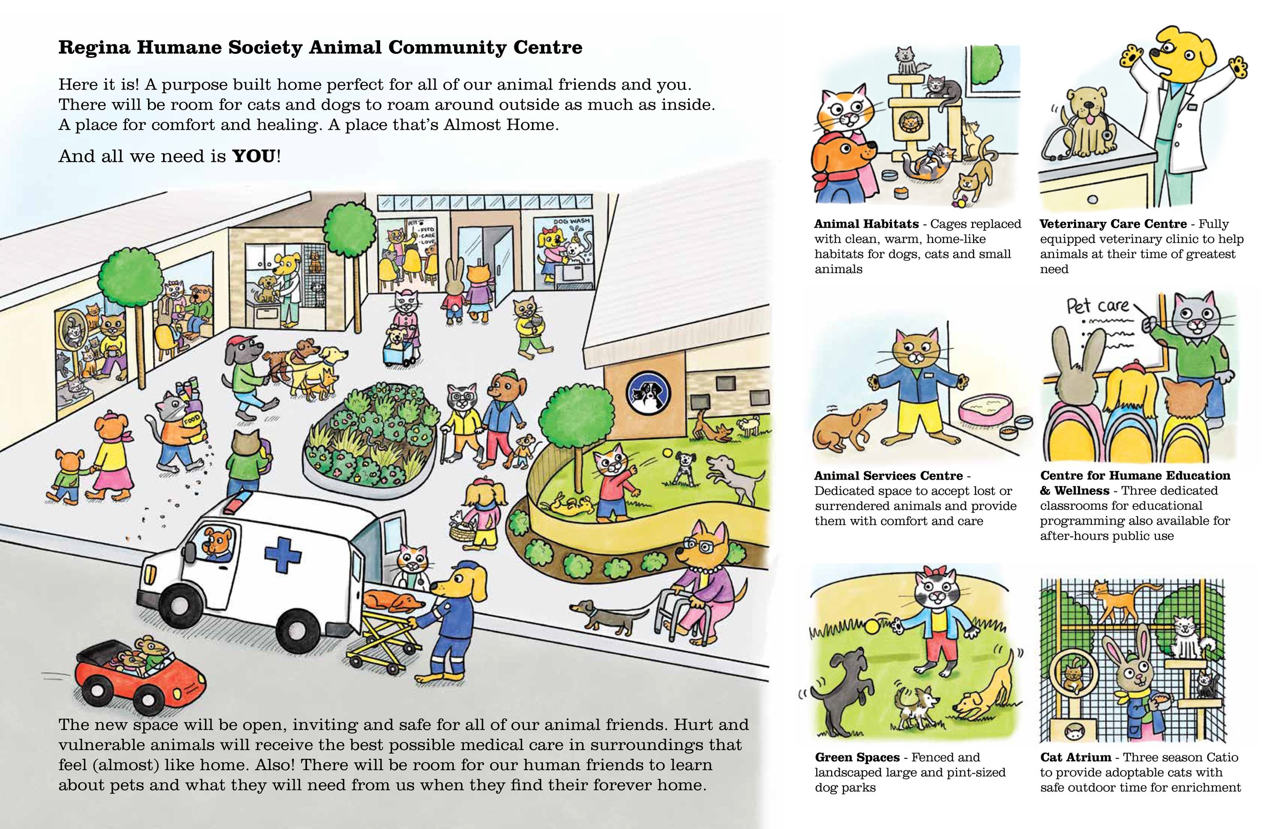
We highlighted some of the unique ways this facility was going to help our animal friends and literally painted a picture of how it would look and function. Donors could and would make this happen! The only thing “we needed” was YOU!

We used the rendering from the architects and make sure if a donor really wanted to get involved, they could easily reach out to a real person, Karen!
This appeal has performed amazingly.
As I tend to say, design is how everything works together. And this piece works together from the start to the end.
Nostalgia is a POWERFUL tool in fund-raising. One that can be and should be used on occasion since it can quickly draw readers back to time and place that hopefully will invoke cherished memories.
This appeal has already raised 200% more than last years spring appeal! That’s not a typo. The appeal has also had a number of larger gifts come in by cheque through the mail and fortunately for our animal friends in Regina, this new facility is well on its way to being built thanks to the hard work of our colleagues at the RHS and the wonderful donors across Saskatchewan.