"Dale's" mail (pt 2): the letters
Last week I decided to wade into “Dale’s” mailbox to look at the direct mail you are sending her, and made a few observations about the outer envelopes (OE’s).
Who is Dale? She’s your donor of course. And she gets a lot of mail. Between 30 - 40 appeals a week during the busiest times of the year.
And today we turn our attention to the letter.

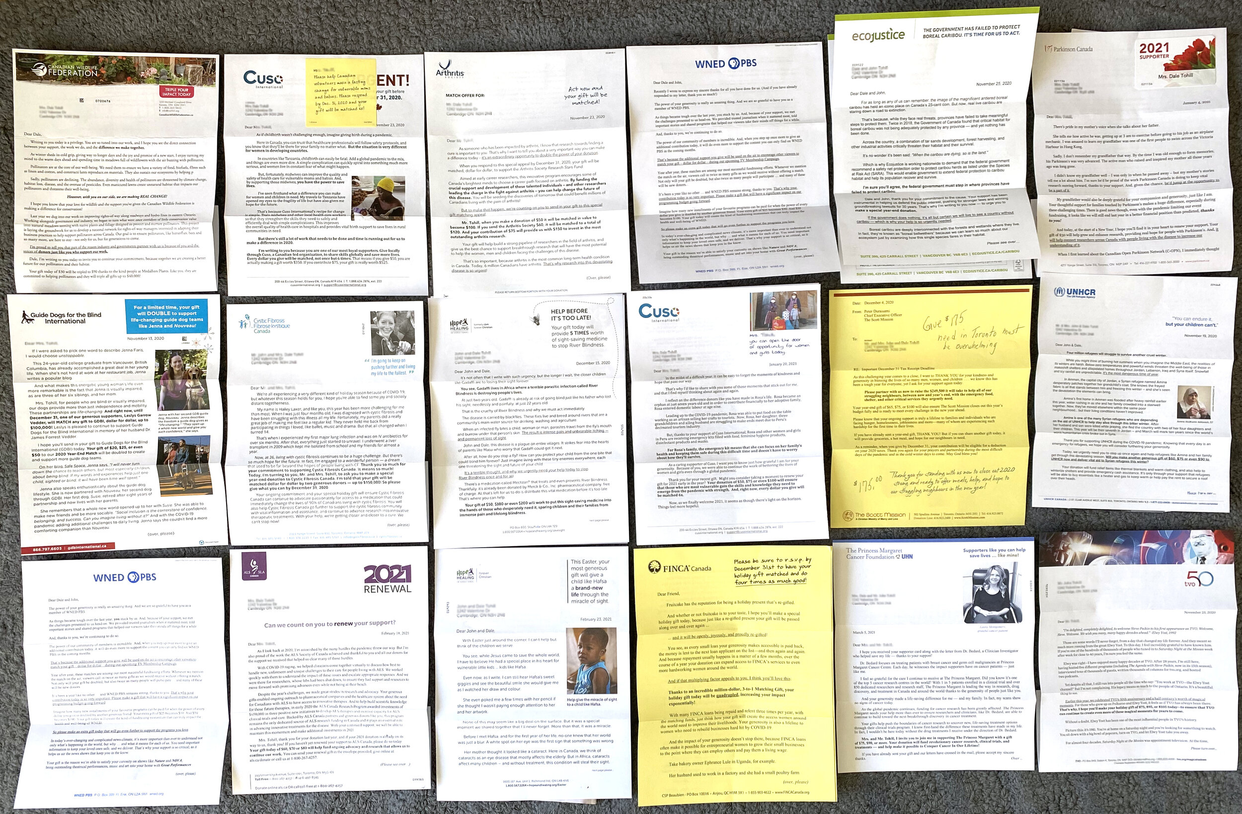
As I mentioned in the previous post, Dale had received (or she only passed along to me) 60 mail packs. Mostly from the year end.
44 (of 60) were “house” mailings. (Packs made for a donor.)
16 (of 60) were “prospect” mailings. (Packs made for a potential donor.)
Of these:
38 (of 60) were “year end” mail packs.
12 (of 60) were “January” mail packs.
7 (of 60) were “February” mail packs.
3 (of 60) were “March” mail packs.
While I was pulling out letters, I also quickly counted to see how many pieces were being included. Far too typical is the good old fashioned, 8.5” x 14” letter/reply combo. You know the one. Where the reply form is perf’ed along the bottom of letter with a ton of tiny check boxes. But we aren’t talking about THOSE today - that’s for another post.
So how many components were in the mail packs?
9 (of 60) had two pieces: letter/reply form (or coupon) + BRE
27 (of 60) had three pieces: letter + reply from (or coupon) + BRE
14 (of 60) had four pieces: letter+ reply form (or coupon) + one insert + BRE
8 (of 60) had five pieces: letter + reply form (or coupon) + two inserts + BRE
1 (of 60) had six pieces: letter + reply form (or coupon) + three inserts + BRE
1 (of 60) had seven pieces: letter + reply form (or coupon) + four inserts + BRE

Ideally, the first thing your beloved donor sees when they open the mail pack is the letter. And typically the first thing they look for is their name.
49 (of 60) were personalized. But some orgs picked personalizing the reply form over the letter (and it doesn’t need to be an either/or consideration), which means:
11 (of 60) were “Dear Friend” or had no salutation whatsoever.
Having a look at the length:
4 (of 60) were half a page.
4 (of 60) were one page.
13 (of 60) were a page and a half.
5 (of 60) were a page and three quarters. (Eyeroll emoji.)
27 (of 60) were two pages.
3 (of 60) were three pages.
2 (of 60) were three and a half pages.
2 (of 60) were four pages.
A few other observations:
33 (of 60) included a PS that reiterated what was being asked of the donor. That’s not good. Aside from looking at their name and the top of page 1, this is the only other thing some donors look at and decide to make a gift. Or not.
6 (of 60) included a photo of the letter signer. Strangely, with the exception of a couple, it was when it was a celebrity signer. We’ve never tested it but we include a photo of the letter signer every time. Doing so adds a face to the name and allows your donor to visualize who is talking to them. And we know humans give to humans. A small touch that goes a long way.
52 (of 60) were “designed”. This isn’t a good thing. The best direct response looks like a personal piece of communication from “me” to “you”. This is not personal preference, this is shown in testing over and over.
Fonts:
22 (of 60) used 11 point type or smaller.
27 (of 60) used 12 point type.
9 (of 60) used 13 point type.
2 (of 60) used 14 point type. Two. This is important to point out since almost every adult over the age of 45 has some type of visual impairment. I’ll let you adjust your glasses as you read this. CNIB (Canadian National Institute of the Blind) uses 16 point or bigger for all of their appeals. We never use anything less than 14 point in ours.
34 (of 60) used a serif type face. Like a Times New Roman or Cambria.
26 (of 60) used a san serif face. Like an Arial or Helvetica. Designers love san serif faces. They are considered far more contemporary than serif faces. That’s why so many of you have design style guides telling designers to use them in your communications and fundraising. And that’s all fine and dandy until you realize that donors have trouble reading small size san serif type on paper. Then you realize - uh oh. If I can’t read your beautiful fundraising, I’m not giving to it.
So, to wrap up, I want to share a few things I’ve learned from 25 years of testing, designing, learning, applying and crafting appeals for donors… (not for “me” and definitely not for “you” - but for the actual audience.
More is more in direct response. 49 (of 60) had basically a letter, a reply and a Business Reply Envelope. Adding an extra piece (or two, or three, or four) will “lift” your response. Think about adding something that will round out your case.
Please, please, PLEASE stop letting your designers CRAM your two page letter into one page in 8 point type. I know what someone is thinking… no one is going to read more than one page. Right? (Eyeroll.) You’re right if your letter is a boring, self centered, victory lap about how amazing you are… but usually, in testing, longer is better. Our friends in the UK, IRE, AUS know this. Almost every letter they put in a pack is at least 4 pages.
Leave the business letters to businesses. You, your ED, your volunteer, whomever, is writing to “me” the donor. This is a personal act. Your letter should look like a personal letter. Indents, short sentences, lots of “you” and “I” should feature throughout.
Take a moment to learn about how your donors “read” your appeal letter. It’s obvious that a lot of writers and designers do not. Only add emphasis to words or sentences that either point out what you are asking the donor to do, or telling them how important they are to the mission.
Your year end is not a case for support. The fact that it is the last month of the year is not a compelling reason for me to give you my hard earned money.
If you want to nerd out more with me about appeal letters, feel free to reach out anytime.
Next up… we will take a look at the 60 reply forms… this should be fun.