#donorlove newsletter audit
Recently, Julie Edwards, Executive Director at The Humane Society of Northeast Georgia, asked us to do a #donorlove audit of her newsletter.These audits can be useful since they are specific to your program, your appeal, your newsletter, whatever it might be.Here is a look at her former newsletter.


Tom Ahern says:

There is no one way to do a perfect donor newsletter. But here’s what we know.
First, it should gush with gratitude and love for your donor— showing them that their care and gifts make amazing things happen.
Second, it should tell amazing and inspiring stories.
Third, testing has shown over and over that the “sweet spot” for newsletters is four pages in length. And that they should never, ever feature crappy photos of people shaking hands with large, intimidating checks in their hands.
Just like a fantastic annual program, your newsletter should be infused, smothered and dripping with #donorlove.
Newsletters, done correctly, should be the trifecta of perfectly executed direct response. It should ASK, it should THANK and it should REPORT back to your donor.
This should not be a PR piece put out by marketing and communications team about how amazing your are.
It sounds like a tall order, but newsletters that are executed this way will raise far more money than any one-off appeal.
For Julie, we went through the whole pack. But here we will focus on the newsletter itself.
Here’s where all of the art and science come together. We know, through testing, that four pages tends to be the magical length. But let your content guide you. If you have 8 amazing stories that celebrate your donor and their actions and you need 6 pages to share them, then use 6 pages!
Before we really dive in, here are some things you should– and should not–do in your donor newsletter:
DO:
• Make the donor the hero
• Use simple easy to read language
• Make it conversational
• Trigger emotions
• Tell stories
• Have a call to action – a good story should inspire them to do more, and give them a specific action to take. Every single story has a specific call to action and donation amount –which is referenced again in the coupon. For the love of goodness – do NOT bury these asks. Bold them. Make them stand out.
• Keep the words small, your font big, and the language simple
• Use words like “you”, “your” and phrases like “because of you”
• Make sure it is skimmable – pay attention to your headlines, photo captions and bolded words. Ask yourself – what would happen if this was ALL the donor read?
DO NOT:
• Brag about your organization
• Talk about how old you are
• Use endless lists of statistics
• Use jargon
• Take all the credit for your mission work
• Use words like “us”, “we” and phrases like “Strategic plan”, “operational roll out”, “enhanced care”, “a special message from our CEO”
So, a just a few suggestions and considerations:
Masthead: LIFE SAVER NEWS
Subhead: Dedicated to rescuing, sheltering and encouraging adoptions of abandoned companion animals.
DONORLOVE: 0.
Can the name of the newsletter be more donor loving and inclusive?
Think of adapting the name of the newsletter into something more donor focused.
Some quick ideas: Our Life Saver, Our Animal Saver, You’re an animal saver!
Subhead: Sharing the difference you make everyday to our animal friends!
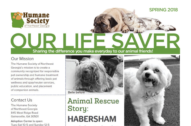
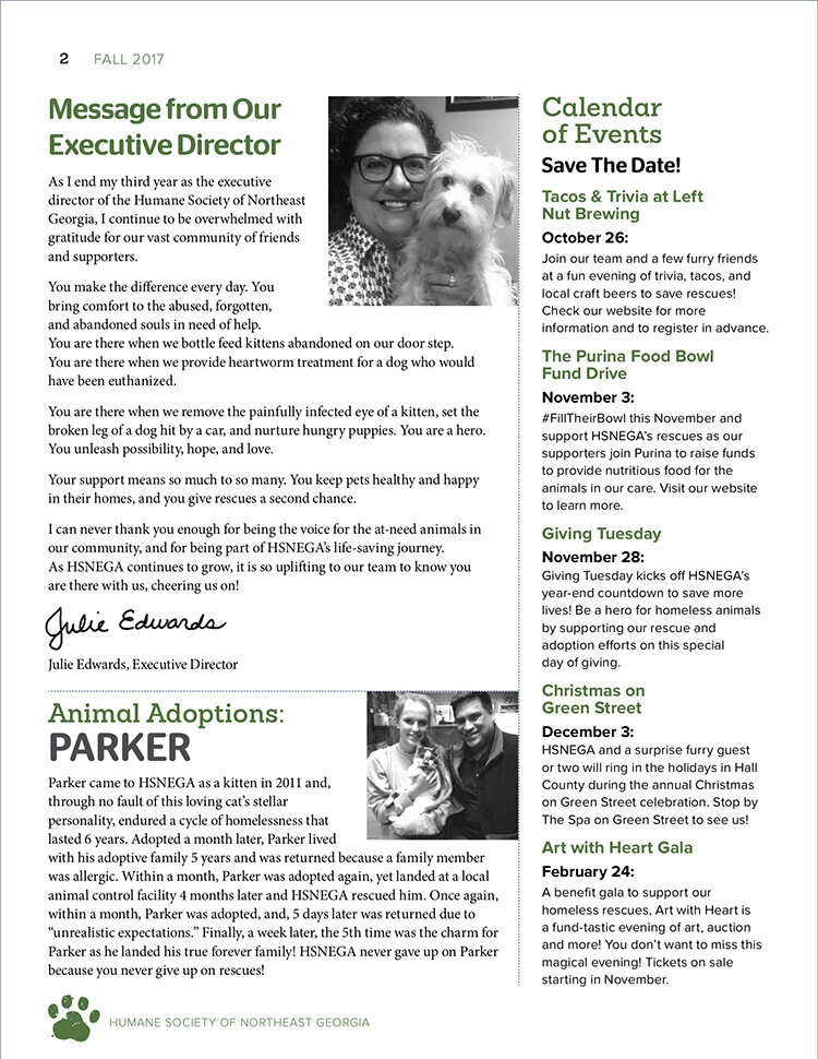
Main article: Animal Rescue Story: Habersham Rescue Case

Only 3 “you’s”.
The article reads like an expired news release filled with fact and figures and uses 12 point Minion font as the main body copy (The larger the type size, the better!).
The rest of the design is pretty good, with lots of white space and rules to separate content out visually. Additional props for the inclusion of the legacy article and wish list on the back page! (Also consider adding some animal fun voices to things like that with a “oh boy oh boy I LOVE GLITTER BALLS” - or add a few photos and costs aside the items! Donors love tangibles!)
Rethink what needs to go into the newsletter.
YOU (the donor) content IN.
WE (the org) content out.
Make headlines and copy much more donor focused and inclusive. You can tell and share the amazing things they’ve made possible or share ongoing challenges with them through emotional stories and photos.
Donor newsletters are not press releases or hard news. It’s not that facts and figures aren’t important, but we know they don’t compel donors to give either.
Make sure your donor gets lots of love in every article. Make them the hero of this piece.
Each article (ideally) ASKS, THANKS and REPORTS.
Consider Tom Ahern’s red pen test. Go through each article and circle the you’s. Done properly, your article be covered in red circles.
Each article should ideally have a reading ease somewhere in the region of 80% and a reading level between grade 4-6.
The other key idea we suggested was to remove the “message from our executive director” and use that as a #donorloving letter and intro to the revamped newsletter.


With these and suggestions, and quite a few others, Julie and her team worked on their next newsletter.
So what happened?
You can read about it more here on Pamela Grow’s blog but as Julie shared:
"Earlier this year, our team decided to “overhaul” our bi-annual newsletter, making it more donor-centric and visually appealing (more photos, color, etc.) following a “newsletter audit” by Agents of Good. The results have been incredible… we exceeded our spring goal for donations from the newsletter by 40%!"
Fantastic! Well done to Julie and the dedicated team at HSNEGA!
If you want us to do a #donorlove audit of your annual program, newsletter, website or legacy program, just reach out!