
A pretty good appeal
This direct mail appeal pretty good. Not perfect, but pretty good.
Not too long ago, I opened my mailbox to find this inside.

What works and what doesn't?
With my professional eye, I appreciated the handwriting. No computer created this! I looked closely at it to see it was from someone I knew even! In this case, it was from my 12 year old daughter Julia. First class stamp! Perfect!
No teaser? No image on the front? How daring! She must have known that less is more with outer envelopes! The less you tell, the more intriguing it can be!
I quickly shrugged off my wish that she had sent this in a larger envelope since it blended in with the rest of the #10 white envelopes in the mailbox - however! This was from my beloved daughter - not some utility company or organization that keeps spelling my name wrong.
I tore it open to see what she had sent me!
And I read her letter.

It's not text book by any means, but here's what I loved!
It was personalized. It used a larger font - which my aging eyes appreciated. And that opening line! GASP! I was hooked.
Julia obviously understands how the best appeals ask for one thing! And she is clear in expressing her problem, her solution and the action she needs me to take. It is written at a grade 4 reading level (between 4 and 6 is ideal!) and has a reading ease of 88%! WOW!
I start to "tsk" when I realized she missed a few things that really would have nailed it. Tom Ahern's "YOU" test. YOU is GLUE - Jooles! She didn't include very many but her passion for getting a new bed kept me reading along. I would have liked her to tell me why I should care about this - and care about this right now - aside from the unspoken fact she is obviously suffering...
Her sign off is pretty cheeky, but she writes with confidence!
And Julia! make sure you include a PS restating what you are asking for! Some parents will only read their name at the top and the PS and then make a decision to take further action or not. Ok?
What else is in here?
This insert.

#heartmelts
A wonderful visual expression to add to her case. Inserts or lift notes are known to increase response rates - something Julia obviously understands. It's simple. I quickly see her vision for how she will fit the larger bed in her room and can imagine her enjoying the extra sleeping space. PERFECT!
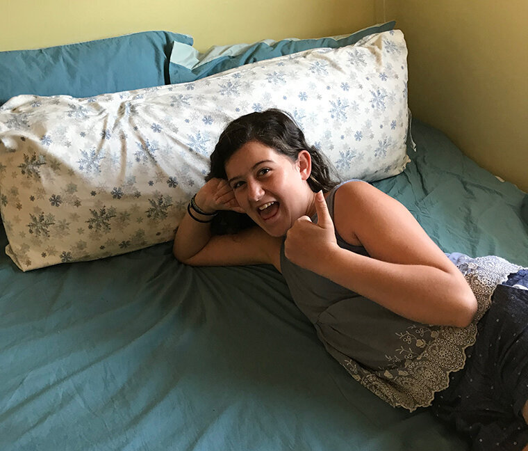
And finally...

This girl. Just take all of my money. <3
A perfect reply form (aside from a few typo's). I love the fact that she is even willing to gift match with us. What a girl. Lot's of white space, personalized for me and mom. Very specific in how much everything will cost.
We obviously live with her, so we won't be mailing it back in a BRE but if we were, I'm positive it would have included our mailing details on it.
I love it.
How could we say no to this almost perfect appeal?
What are your favourite parts?