
Top 10 #donorlove design considerations
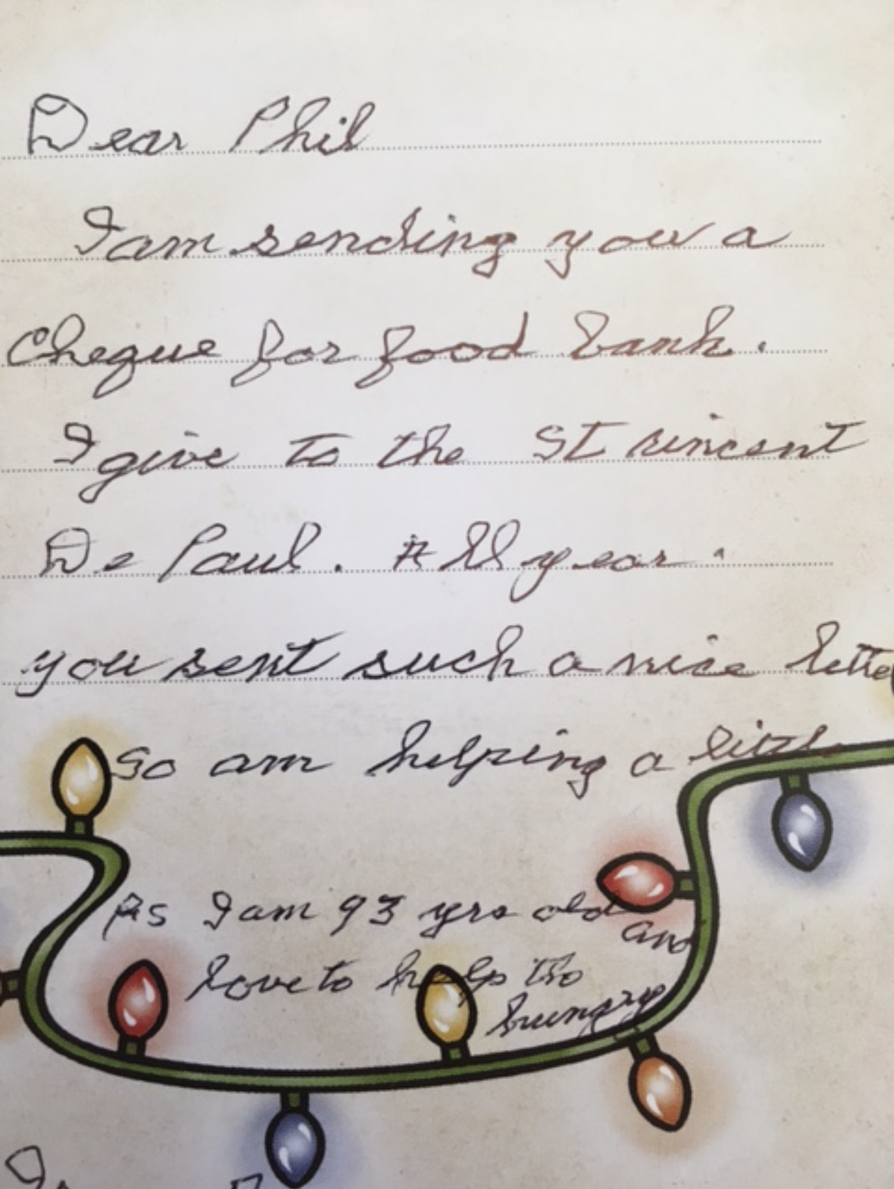
Dear Phil. I am sending you a cheque for the food bank. I give to the St Vincent de Paul. All year. You sent such a nice letter so I am helping a little. PS I am 93 years old and love to help the hungry.
**PLEASE FORWARD THIS TO YOUR MARKETING AND COMMS DEPARTMENT**
As a graphic designer and donor champion, I spend a lot of time thinking about the needs of donors.
May I remind you, my friends and colleagues, that your amazing donors are very likely, women in their late 60's to early 90's.
And I know you see their shakey, lovely handwriting on your coupons all the time.
So... CAN YOU PLEASE stop letting your designers putting these tiny, little boxes on your reply forms for them to somehow fill in? You are literally hurting them and their hands. Same thing goes for type.
Almost everyone over the age of 45 has some level of visual impairment. Your direct mail piece using some hot, new, sans serif type at 9 point MAY adhere to your soul destroying graphic standards created by a clueless marketing agency from downtown - but your loving donors will not be able to read it and will just get even more frustrated about their declining eyesight.
So, in this spirit, I want to share with you my TOP 10 graphic design considerations for your direct response (especially those of you who are also designing information about legacy giving).
Contrast: Use a high contrast colour for text and background. Good examples are black or dark blue text on a white or yellow background, or a white/yellow text on a black/dark blue background. Do not design large blocks of copy with reversed out (white text on a dark box) type.
Type Colour: Print material is most readable in black and white. If using coloured text, restrict it to things like titles, headlines or highlighted material.
Point Size: Bigger is better. Keep your text large. Preferably between 12 and 18 point (depending on the font - point size varies font to font). Consider your audience when choosing point size.
Leading: Leading is the space between lines of text and should be at least 25% - 30% of the point size. This lets readers move more easily to the next line of text. Bolder type will need slightly more leading.
Fonts: Avoid complicated or decorative fonts. Choose standard fonts with easily-recognizable upper and lower-case characters.
Font Weight: Opt for fonts with medium weight (or heaviness) and avoid light type with thin strokes. When emphasizing a word, italics and upper-case are not recommended.
Letter spacing: Don’t crowd your text. Keep a wide space between letters.
Margins & Columns: Separate text into columns to make it easier to read, as it requires less eye movement and less peripheral vision.
Paper: Use a matte or non-glossy finish to cut down on glare. Reduce distractions by not using watermarks or complicated background designs.
Clean Design & Simplicity: Use distinctive colours, sizes and shapes in your design but ensure that each element supports the message of the piece.
Credit to CNIB for the inspiration.